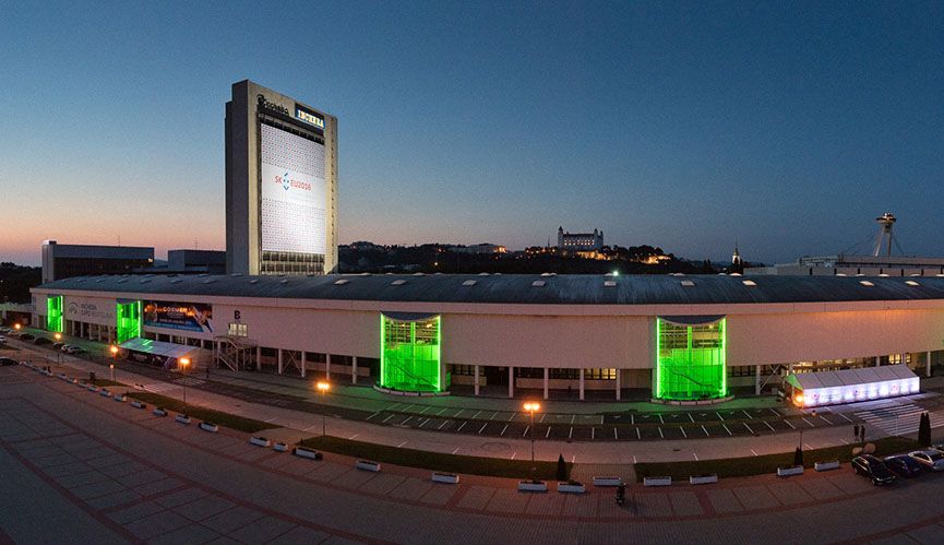
It all started two years ago, when we, with Incheba as our favourite client, started to consider the need for a new website. It started with a microsite for the biggest car show , Autosalon, which was a great success.
The design decides
The need to update the outdated website was more than appropriate, so we started to outline the first versions of the website. However, even many iterations of the design didn’t bring us closer to the much desired WOW effect in the client’s eyes. After all, we wanted to create the best website – both in design and function – in Central Europe and the surrounding area. So we called in the help of the people from GoodFridays design studio. They didn’t deny their talent and created a design gem right the first time, the implementation of which you can see in the live version.

But the design was just the beginning. The implementation into WordPress has just begun
In addition to perfect design, functionality was the main requirement – and this time it was absolutely precisely specified. Compared to the original solution, it was necessary to incorporate a large amount of data that is interconnected.
So we struggled with the graphics
We created a piece that looked amazing in the picture, but we had to get it up and running on every computer, tablet and mobile so that it still looked amazing, made sense and was still usable.
Notice the spaced out details – the control bar on the left side of the page, which moves in counterpoint to the scrolling of the site. This gives you the ability to navigate to the most visited pages at any given moment. The gracefully flying balls in the colours of the Incheba logo have certainly not escaped your attention. These were more difficult, because there can be neither too many nor too few of them, they must not disturb but captivate. And so we coded, adjusted, approved and found it!
We made sure that these elements don’t overload the browser, because even if it doesn’t seem like it, calculating the seemingly random movement of twenty elements in three axes at the same time, and in such a way that they don’t interfere with each other’s quadrants of movement, is not a trivial task – neither for the developer nor for your computer’s processor. You can see how it turned out in the speed section below.
The graphics are beautiful and it works. Now how to get the data there?
We first brainstormed with the client about what visitors actually expect from the site at different stages, and then analyzed the data from Search Console and Analytics to see which subpages they use to enter the site, how they navigate the site, and where they end up. This influenced the final design and structure of the site.
Each show or event can have up to 13 properties, each of which has both configurable and selectable parameters. That’s quite a bit of data, which is additionally used in other parts of the site, such as blog posts and press releases can contain directly the agenda of the show they relate to or a list of exhibitors. The exhibition in turn contains press releases that relate to it. Simply a well thought out spider web of data that interact with each other to create rich content.
Many pages on the site are designed individually with respect to their function, and therefore it was necessary to link the individual designs individually to WordPress so that they are editable separately.
What about the loading speed? Let’s not forget the critical 3 seconds
Okay, so the site is extensive and contains design tweaks that can bring a weaker mobile or computer to its knees. So how do we ensure loading speed? With quality back-end development!
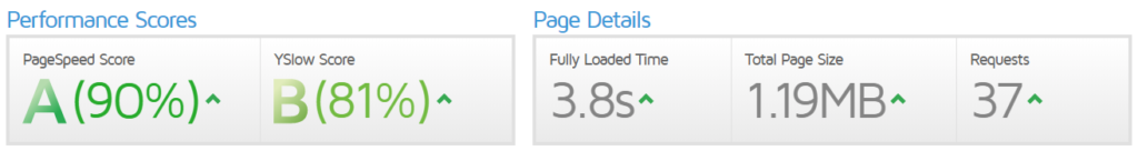
The first rendering (First Meaningful Paint) occurs in just 0.6s and the final effects are loaded after the page is fully loaded in 1.9s, when the page is fully usable and only background scripts are loaded. See for yourself – a complete page load of this one from Vancouver, for example, takes just 3.8s. Not for nothing have we earned a big A. Not only the user likes this, but also Google. Feel free to test your site on GTmetrix, you should have it under 5 seconds, less than 3MB and less than 100 requests per server (requests).
How long did it take?
Thanks to the excellent cooperation with the client, we didn’t have a single day of delays and the website was ready in 2 months from the first presentation of the graphics. Of course, there were some comments and adjustments, but we took that into account and took 1 month to debug bugs and upload content. Meanwhile, the programming took 6 weeks of pure time and the handover took place on the day exactly according to the initial plan.
What does the client say?
“We postponed the creation of the new website for a long time for one reason – we were not 100% satisfied with any of the solutions proposed by potential suppliers. Our intention was that the website should visually reflect our activities as an exhibition company, but at the same time be pleasant, playful and emotional. We wanted the new site to be as clear and factual as possible, but at the same time to contain all the necessary information that visitors, exhibitors and clients are looking for. GoUP did an excellent job as project developer, consultant and supplier of quality solutions. We highly appreciate the prompt response and meeting the deadlines, which we set quite boldly. We are duly proud of our new website and believe that it will be highly appreciated by its visitors.”
Mgr. Martina Macková, PR manager/spokesperson
What to touch. Perhaps only that we nominate this work for the prestigious Awwwards award. And if you’d like to see something similar on your site, feel free to contact us.
As a performance agency we create just over 20 websites a year, but for an interesting and well thought out project we are happy to set aside a few hundred programming hours. Take a look at our other projects.